
Figure 1.
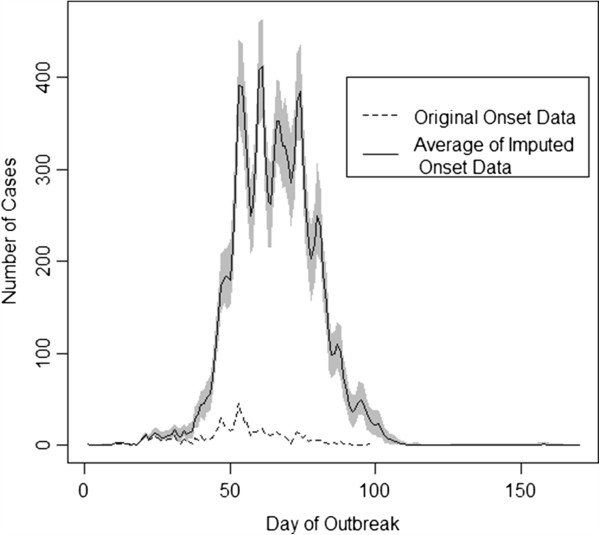
Imputed epidemic curves. Gray shading indicates the variability in the imputed data. The dashed line indicates the observed onset data.
Official websites use .gov
A
.gov website belongs to an official
government organization in the United States.
Secure .gov websites use HTTPS
A lock (
) or https:// means you've safely
connected to the .gov website. Share sensitive
information only on official, secure websites.
Imputed epidemic curves. Gray shading indicates the variability in the imputed data. The dashed line indicates the observed onset data.