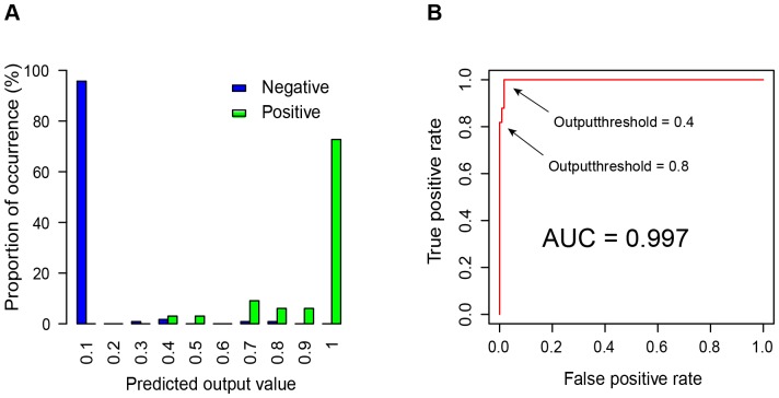
Figure 2. Selection of the cutoff threshold for discriminating positives and negatives.
A) the distribution of predicted outcomes of the positive and negative datasets. Each bar corresponds to a given range of predicted likelihood of affecting transcription by ERVs, and the height of the bar represents the percentage of ERV insertions with a predicted value within that range. Green and blue bars represent positive and negative data, respectively. Panel B shows the performance of the trained MLP model using ROC curve analysis based on the positive and negative datasets. AUC stands for ‘the area under the curve’. As shown by the two arrows in the figure, when the cutoff threshold is set at 0.4, the model's true positive rate reaches 1; when the cutoff threshold is set at 0.8, the model's false positive rate is 0.

