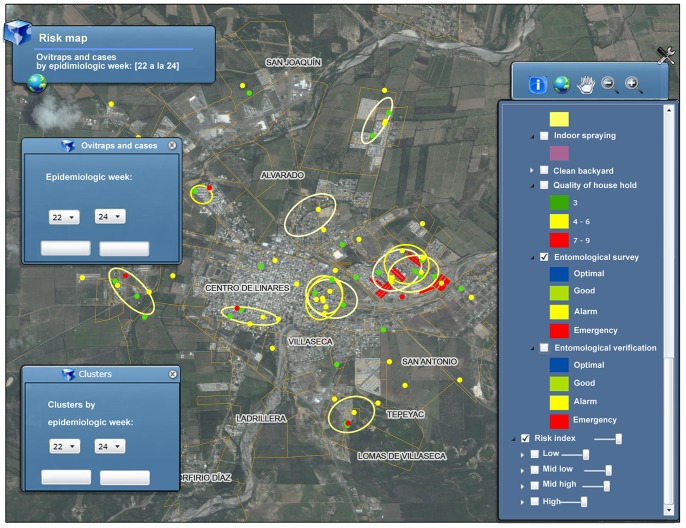
Figure 4. Screenshot of Dengue-GIS application.
Dengue-GIS screenshot showing the distribution of probable cases and case clusters (high transmission areas) during the CDC weeks 22–24 2012 in Linares City, Nuevo Leon. Locations of entomological survey activities during the same period are shown in red. DF cases accumulation in space and time is showed by a set of ellipses which represent the graphical output of the cluster detection algorithm. Two areas, one very close to downtown Linares, and the other to the west of the city show three intersecting ellipses, this indicates that transmission occurred uninterrupted during the three week period showed. Cases are represented by dots; red dots are laboratory confirmed cases, green dots are cases discarded by laboratory tests (other disease) and yellow dots are those for which there is not available laboratory data (either because it was not selected for blood test, according to surveillance protocol or because the public health laboratory has not yet got/entered the respective results). Red squares represent the city block where the entomological surveys were carried out, showing emergency results. Entomological surveys are a separate surveillance activity in which information about the conditions of households is collected. Pictures presented here were modified to translate the text presented to English; the actual Dengue-GIS is an all-Spanish language system.

