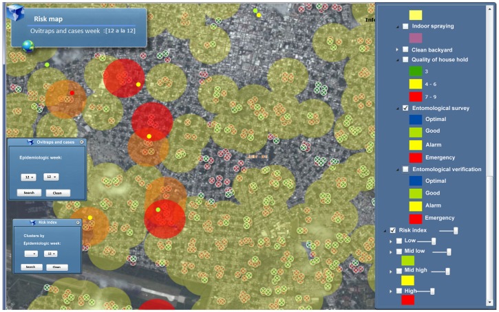
Figure 5. Screenshot of Dengue-GIS application showing the transmission risk index.
Every Tuesday an evaluation of the abundance of the vector population, estimated by the mean number of eggs per city block and the presence of probable dengue cases is carried-out. The color coded circles represent areas of differential dengue transmission risk: high (red), moderate-high (orange) and moderate-low (yellow). Low risk areas are not shown.

