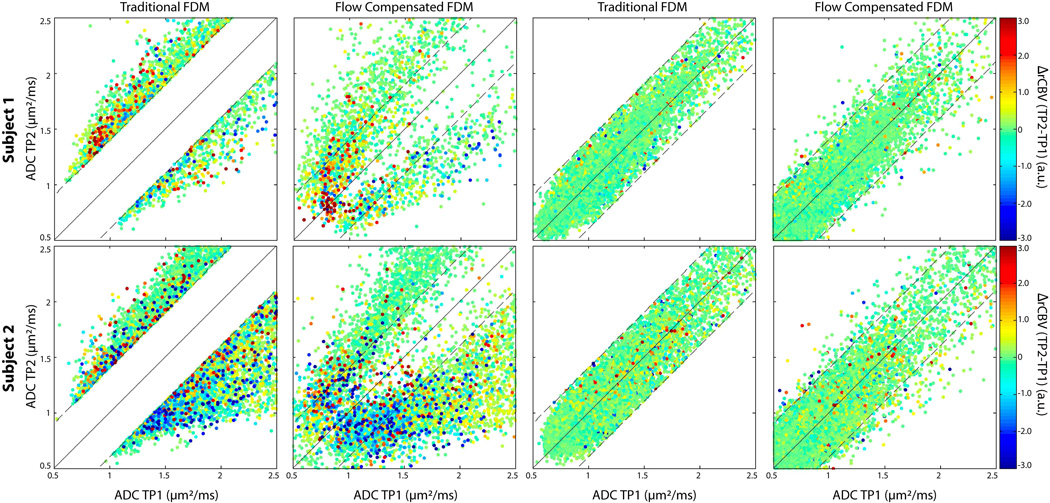
Figure 3.
FDM scatter plots. Each row shows FDM scatter plots from three representative patients, with each point representing one voxel. The horizontal axis is the ADC from TP1, the vertical axis is the ADC from TP2. The color of each point represents ΔrCBV from TP1 to TP2. Red and blue colors indicate an increase and decrease in rCBV respectively. Column 1 shows iADC and dADC voxels on the tFDM, and column 2 shows the same voxels on the fcFDM. Columns 3 and 4 show scatter plots of ncADC voxels on the tFDM and those same voxels on the fcFDM respectively

