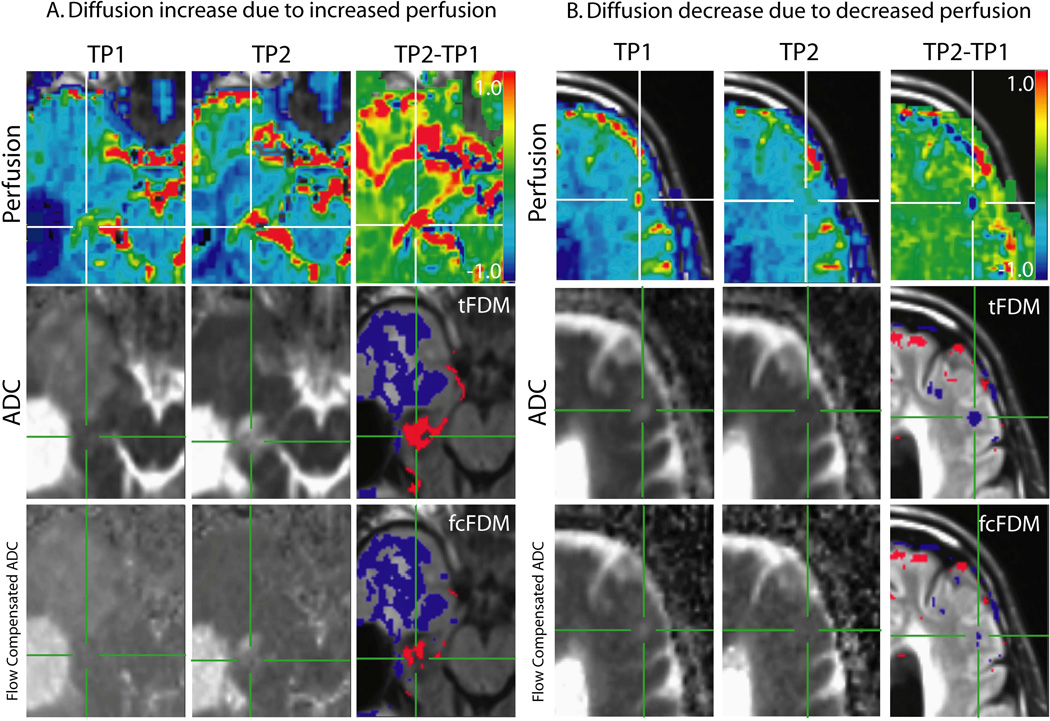
Figure 5.
Perfusion and diffusion maps in areas of significant changes in diffusion. The top row shows rCBV maps from TP1 and TP2 and the difference between the two (TP2-TP1, ΔrCBV). The middle row shows ADC calculated from b = 0 and 1000 s/mm2 from TP1 and TP2 and the resulting tFDM. The bottom row shows the flow compensated ADC maps calculated from b = 500 and 1000 s/mm2 from TP1 and TP2 and the resulting fcFDM. A. iADCtFDM voxels (red voxels) are due to an increase in perfusion rather than an increase in cellularity. In voxels that show up as iADCtFDM and ncADCfcFDM there is a corresponding increase in perfusion on the ΔrCBV map. B. dADCtFDM voxels (blue voxels) are due to a decrease in perfusion rather than a decrease an increase in cellularity. Where voxels show up as dADCtFDM and ncADCfcFDM there is a corresponding decrease in perfusion on the ΔrCBV map.

