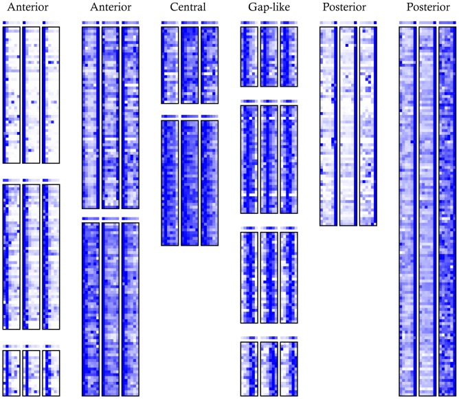
Figure 2. Heat maps of gene expression clusters.
Of the k = 20 clusters, 13 with non-uniform patterns are shown. The expression levels for each gene was normalized for clustering and display so that the maximum expression of each gene in each embryo is dark blue. The plot above each cluster is the mean normalized expression level in that cluster. All clusters are listed in Dataset S3.

