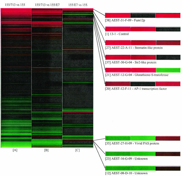
FIG. 3.
Visual representation of hierarchically clustered hybridization data sorted according to similarities in gene expression patterns. Column A represents the average log2 (cy3/cy5) ratio for each cDNA clone measured in six hybridizations of EP155/CHV1-EP713 versus EP155. Column B represents the average log2 (cy3/cy5) ratio for each cDNA clone measured in five hybridizations of EP155/CHV1-EP713 versus EP155/CHV1-Euro7. Column C represents the average log2 (cy3/cy5) ratio for each cDNA clone measured in six hybridizations of EP155/CHV1-Euro7 versus EP155. In columns A and C, red lines indicate an increase in transcript abundance in hypovirus-infected strains relative to virus-free EP155. Green lines indicate a decrease in transcript accumulation. In column B, red lines indicate an increase in transcript abundance in EP155/CHV1-EP713 relative to EP155/CHV1-Euro7. Green lines indicate a decrease. In all columns, black lines indicate no significant change in transcript accumulation between biological samples. Clones of interest are highlighted to the right of the cluster diagram. Each clone is preceded by a number in brackets, which refers the reader to the real-time RT-PCR data in Table 3.

