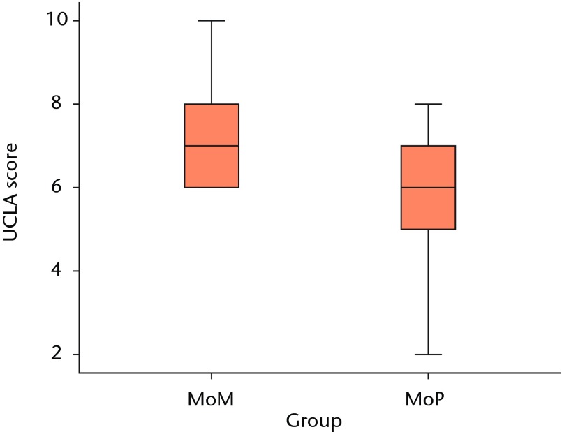
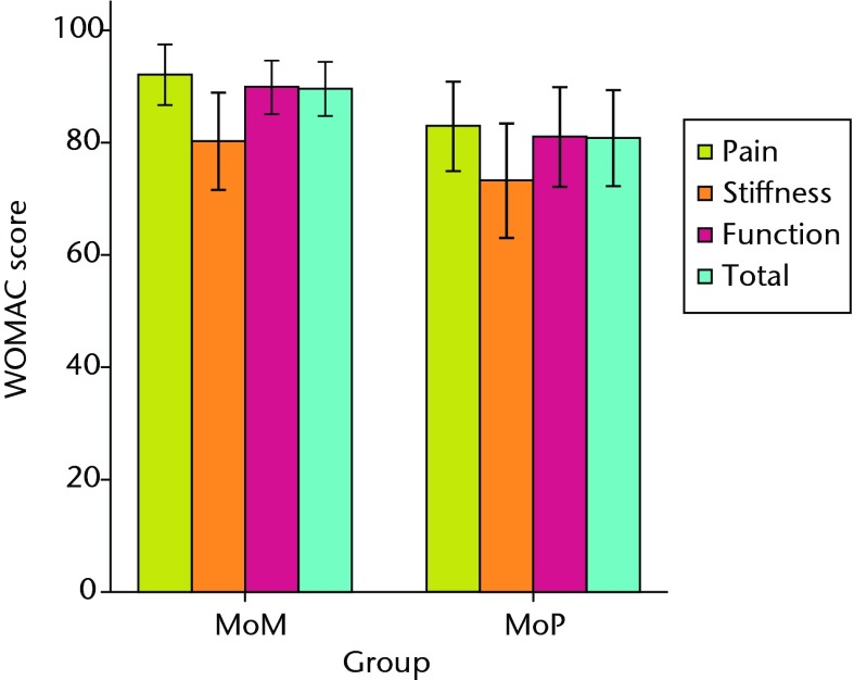
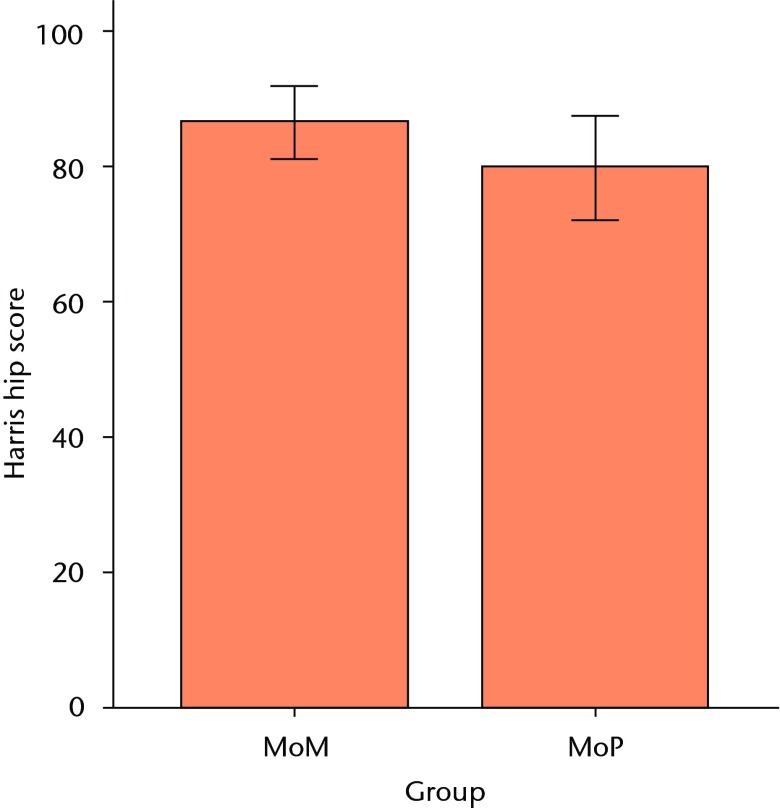
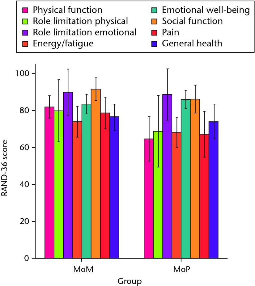
Figs. 3a - 3d.
Graphs showing the outcome at two years in the metal-on-metal (MoM) and metal-on-polyethylene (MoP) groups. Figure 3a – boxplots showing the mean University of California, Los Angeles (UCLA) activity score. The boxes represent the mean and interquartile range (IQR) and the whiskers denote the range of data. Figure 3b – histogram showing the mean Western Ontario and McMaster Universities (WOMAC) osteoarthritis index by total score and subscore. The error bars denote the standard deviation. Figure 3c – boxplots showing the mean Harris hip score. The boxes represent the mean and IQR and the whiskers denote the range of data. Figure 3d – histogram showing the mean RAND-36 score by different parameter. The error bars denote the standard deviation.


