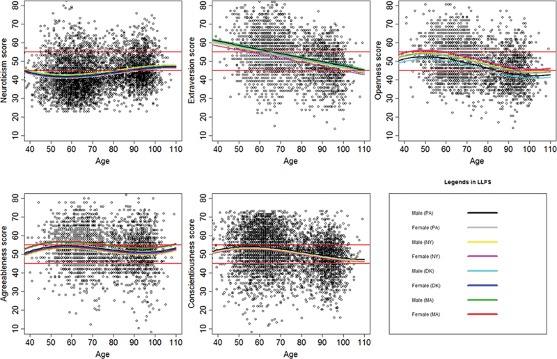
Figure 1.
Scatter plots of NEO scores in participants of the LLFS. The y-axes report the T-score for the five domains included in the NEO-FFI. The x-axes report the age at the test. The color lines represent the fitted values by gender and field center as explained in the legend. The area between the two red horizontal lines indicates the normal range for T-score values.

