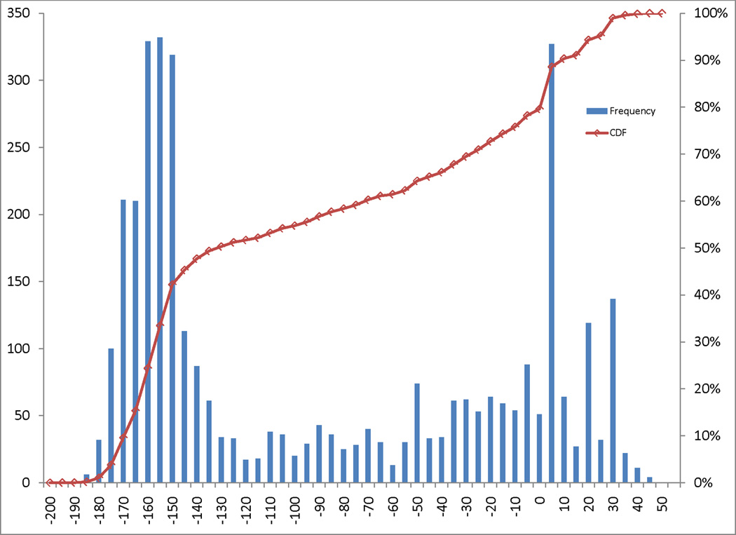
Figure 1. Distribution of PECONPI scores.

The distribution of PECONPI scores are illustrated in a histogram. Each bar represents a five point score spread, with the height indicating the frequency of that score. The red square boxes correspond to the percentile rank of each score, with 100% representing the top score. Scores with 25 or greater points corresponded to the top four percent of all calls.
