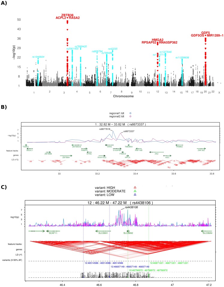
Figure 2. Manhattan and regional plots of random datasets.
Part (A) shows a conventional manhattan plot as produced with the default options on an artificial GWAS dataset. Peak SNPs that exceed genomewide significance are colored in red and are annotated with the closest genes (covering genes are placed above for intragenic SNPs, up- and downstream gene left and right). A second threshold is set by default for suggestive association at P<1*10−5 with gene annotations in blue. Annotation text can be deactivated or replaced with the identifiers of peak SNPs. Part (B) and (C) display regional plots with different unique capabilities. Both contain tracks showing the association p-value graph, genes with strand and exon information and a triangle LD plot where the color intensity reflects the r2 correlation between SNPs. Identifiers of queried SNPs are automatically annotated to the pvalue graph but can take custom annotation text as well. The LD plot uses either custom genotype files or HapMap data and is available for arbitrary large regions. In (B), r2 values have additionally been annotated to the LD triangles and we compare p-value graphs of two distinct datasets (color code listed in the legend). In (C), rare variant information from a resequencing study is included in a track at the bottom, showing allele frequencies in a histogram at the very bottom and identifier, position (original and remapped) and calibration lines for selected variants above. Only de novo variants are displayed here using filter settings on the histogram. A second filter has been set on the position information display to include only variants of certain predicted functional effects (determined by SnpEff). The color code for the variant effect is listed in the plot legend above.

