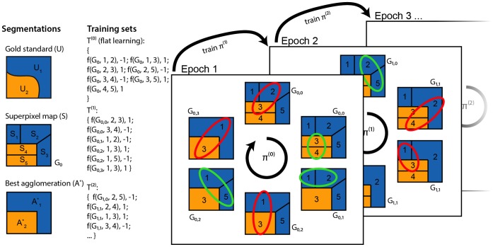
Figure 3. Schematic of our approach.
First column: A 2D image has a given gold standard segmentation  , a superpixel map
  (which induces an initial region adjacency graph,
  ), and a “best” agglomeration given that superpixel map A*. Second column: Our procedure gives training sets at all scales. “f” denotes a feature map.
  denotes graph agglomerated by policy
  after
after  merges. Note that
  only increases when we encounter an edge labeled
  . Third column: We learn by simultaneously agglomerating and comparing against the best agglomeration, terminating when our agglomeration matches it. The highlighted region pair is the one that the policy,
  , determines should be merged next, and the color indicates the label obtained by comparing to A*. After each training epoch, we train a new policy and undergo the same learning procedure. For clarity, in the second and third columns, we abbreviate
  with just the index
  in the second and third arguments to the feature map. For example,
  indicates the feature map from graph
  and edge
  , corresponding to regions
  and
and  .
.

