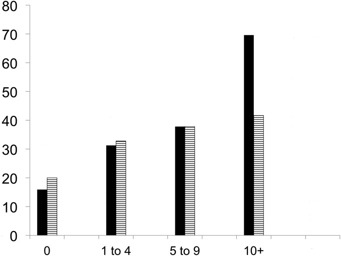
Fig. 2.

Bar graph showing the proportion of subjects with poor post-arthroplasty function according to pre-arthroplasty contralateral knee pain. The y axis shows the proportion (percentage) with poor function, and the x axis shows the pre-arthroplasty contralateral knee pain category. The black bars indicate the proportion that did not achieve the threshold PASS score (p value for trend, <0.0001), and the striped bars indicate the proportion with a slow walking speed (p value for trend, 0.04).
