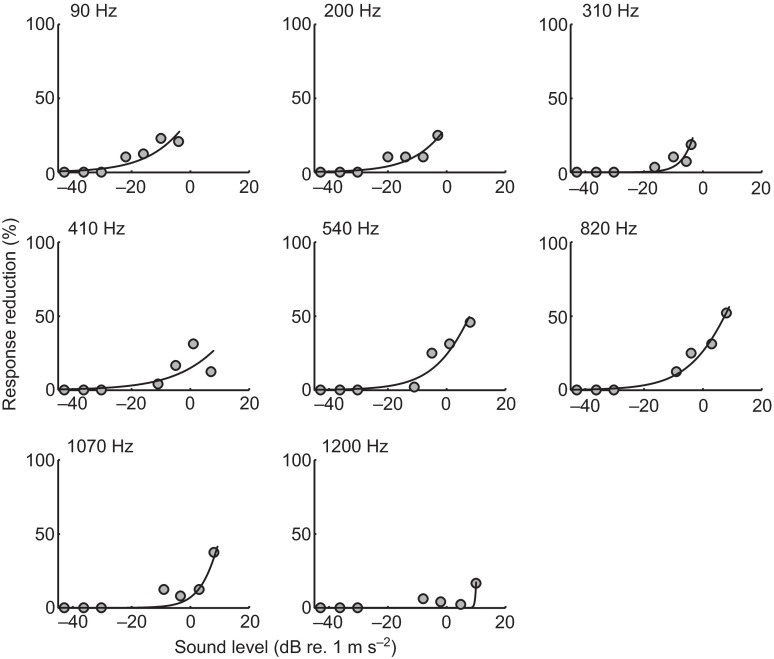
Fig. 8.
Example of curve-fitting to prepulse response data. Each point shown is the mean difference between the response percentage at that frequency and sound level (dB re. 1 m s−2; x-axis) and paired no-prepulse catch trials preceding and following the prepulse stimulus. Similar to the startle response data, a Weibull curve is fitted using an MLE criterion and threshold is characterized as the sound level at which the model predicts a response reduction of 5% (y-axis).

