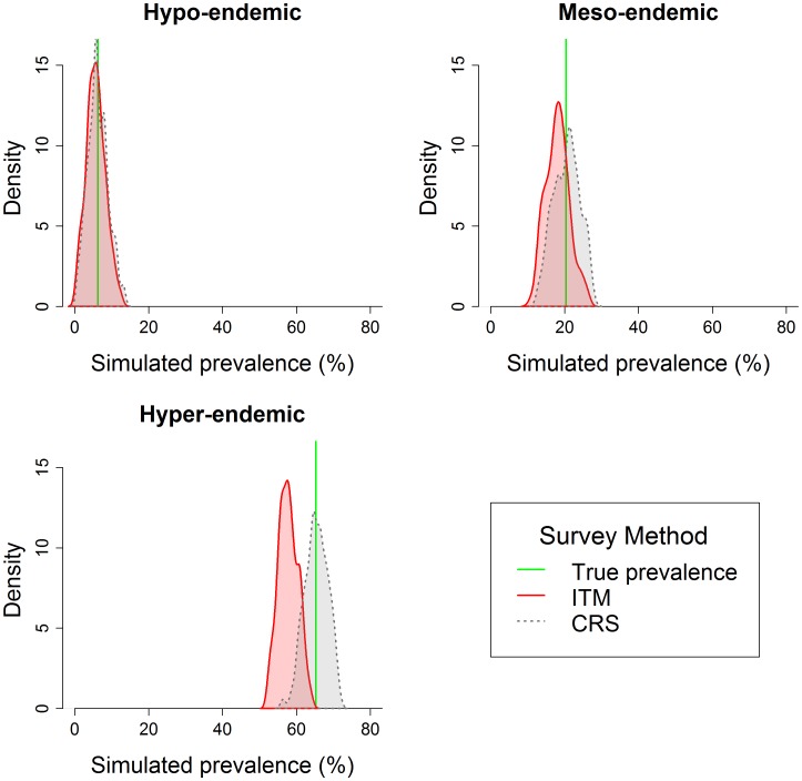
Figure 2. Density plots of prevalence estimates generated by CRS and ITM sampling methodologies.
Plots are generated using simulated data and present results from a single district within each endemicity class. The red line represents the true district-level prevalence, the curves are histograms of values from 1000 simulations using the CRS method (red) and ITM method (blue).

