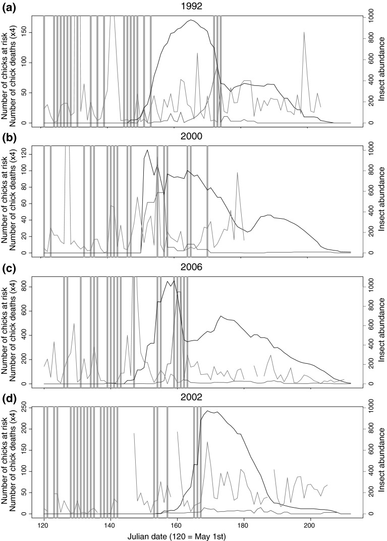
Fig. 4.
Combined graph of insect abundance (purple), number of chicks at risk of death on a given day (black), calculated number of chick deaths (red), and cold snap occurrence by Julian dates for: a 1992, b 2000, c 2006, and d 2002. Light blue vertical bars indicate days that were part of a cold snap as defined by the 18.5° maximum temperature threshold. Number of chicks dying each day is multiplied by four to allow plotting on the same y axis as chicks at risk (color figure online)

