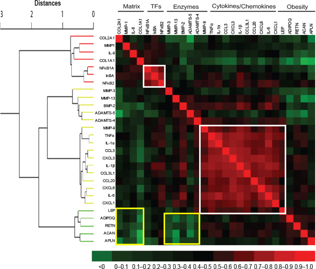
Fig. 4. Inter-relations of gene expression levels.
The gene expression values were subjected to separate different categories for their inter-relationship. For this, hierarchical cluster dendrogram was generated using Ward Minimum Variance Method and it comprised of 28 modules with four categories. The Correlations were converted to distances between 0 and 2, where d = (1 – r).The adjacent modules are related closely in terms of expression profile and similarity in correlation fades away with the increase in distance. The heat map was then manually generated from correlation matrix to see the pairwise correlations of candidate genes. In the heat map, the dark red color shows a strong positive expression correlation while dark green color depicts weak expression correlation while the rest color codes fall in between. The two gene categories were strongly correlated (red areas surrounded by white squares) while two gene categories were weakly correlated (green areas surrounded by yellow squares). TFs = transcription factors.

