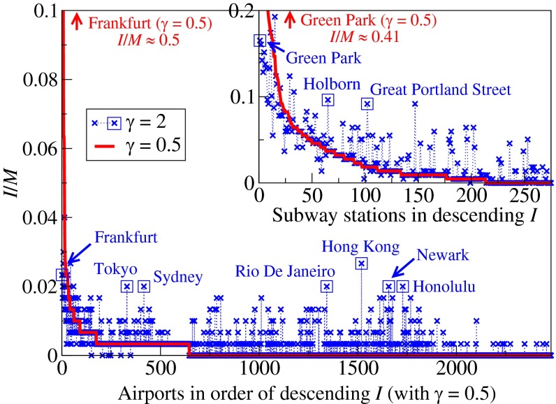
Fig. 3.
Optimized traffic at individual airports and London subway stations (Inset). The airports and stations are plotted in descending order of traffic in the optimized state of  (red lines). Symbols (
 ) in blue correspond to the optimized traffic with
  . Squared symbols refer to airports and stations mentioned in the main text that have much higher traffic than that indicated by the red lines. The optimized airport traffic is obtained from the single instance shown in Fig. 5, and the optimized subway traffic is obtained by averaging over the 30 passenger sets as in Table 1.

