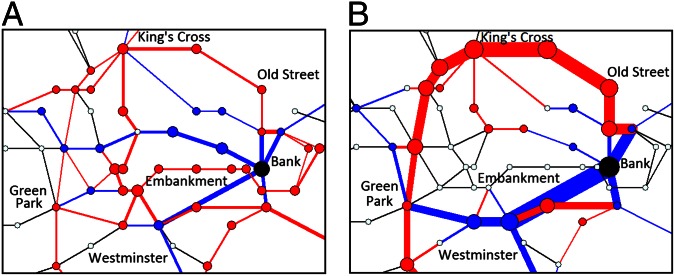
Fig. 5.
Changes in optimized traffic in the central London subway network after the removal of the station “Bank” (black node). The corresponding costs are  (A) and
  (B). Nodes and edges that show an increase (decrease) in traffic appear in red (blue), where their size and thickness correspond to the magnitude of increase (decrease). Nodes and edges with no traffic changes appear in white and black, respectively. Passenger source–destination pairs are identical to those of Fig. 3, except for the removal of pairs starting or ending destinations in Bank.

