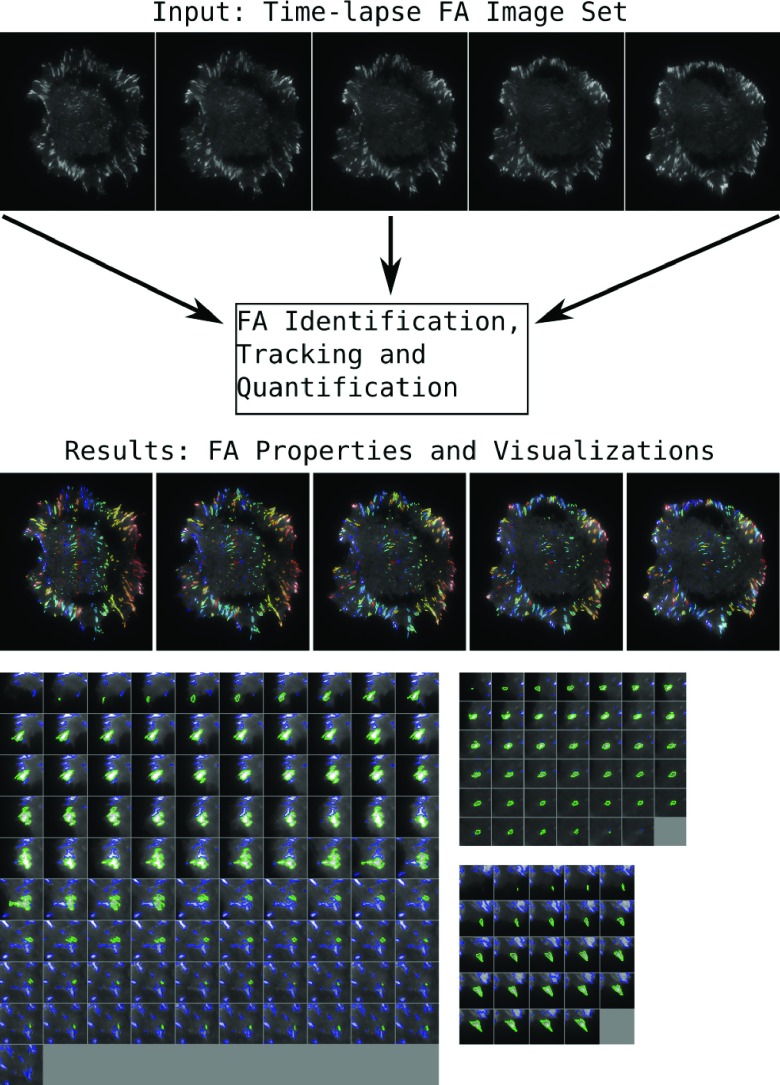
Figure 1. Sample input images and output visualization from the focal adhesion processing pipeline.
The results section shows examples from the visualizations produced by the pipeline. In the top example, the entire cell is shown, with an individual adhesion outlined and tracked through time. The bottom three examples show single adhesions, outlined in green, with other nearby adhesions outlined in blue.

