
Figure 5. Binary Network Organization in Health and Disease.

(A–B) Example binary network diagnostic curves as a function of threshold: the modularity for controls (HC; black) and people with schizophrenia (SZ; red) (A), and the robustness to targeted attack for controls (black) and people with schizophrenia (blue) for  -band networks. Individual curves indicate average values for each individual over the 66 trial-specific networks. (C) Significant group differences in graph diagnostic versus cost curves for 12 graph diagnostics (y-axis) in both intra- and inter-frequency bands (x-axis). Warm colors indicate that the diagnostics values were higher in people with schizophrenia than in healthy controls; cool colors indicate that the values were higher in healthy controls than in people with schizophrenia. Both warm and cool colors are two different shades corresponding to different levels of stringency for significance testing: false discovery rate (
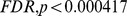 ), and uncorrected (
 ). See Figures S2 and S3 in the SI for the full graph diagnostic versus cost curves for all subjects, frequency bands, and diagnostics.