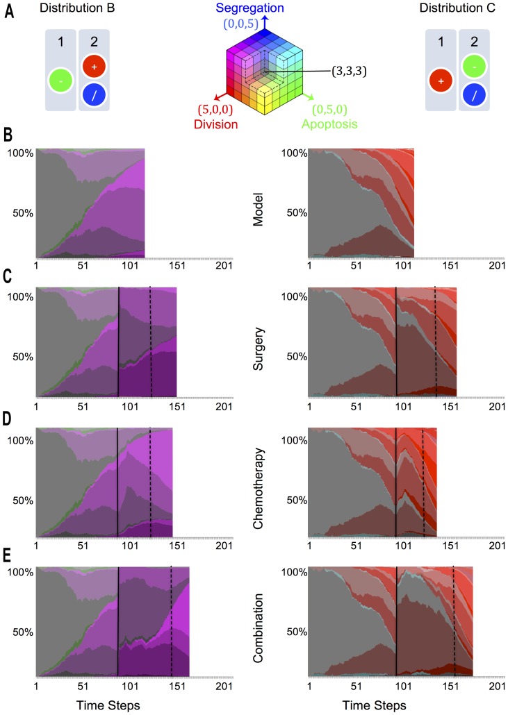
Figure 3. Genotype diversity.
A. The two over-proliferative genetic arrangements, in simulated diploid chromosomes, and the RGB key in the middle. We have used the RGB colour model to visually describe the different genotypes that evolve in the system by normalizing the maximum observed Genotype State (See Methods, RGB Key). We have assigned a colour to each of the abstracted genes: Red for division, green for death and blue for segregation. By comparing via an RGB system the colours assigned to a given genotype, we are able to tell visually the proportions in which the genes are distributed, with intensity values corresponding to the number of genes: (0,0,0) being black, the initial genotype (2, 2, 2) being dark grey and the maximum observed genotype (5, 5, 5) being white. B. Representative Marble Diagram for a simulation with the Model. These diagrams display the stacked percentage of Genetic Diversity across time for a representative simulation of Gene Configurations B and C across different scenarios. The beginning of therapies (when reaching 1000 cells) are marked with a black vertical line, while relapse times (when reaching again 1000 cells) are marked using a dashed line. C. Representative Marble Diagram for a Simulation of Surgery. D. Representative Marble Diagram for a Simulation of Chemotherapy. E. Representative Marble Diagram of a therapy combination of Surgery followed by Chemotherapy.

