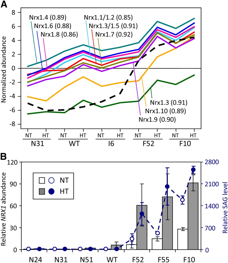
Figure 10.
SAG and NRX1 Transcript Abundance.
(A) Microarray hybridization signals of NRX1 probes (solid lines) correlated with SAG abundance (dashed line) across genotypes and treatments. Only the best-matching NRX1 name is shown for each probe (see Supplemental Table 3 online for gene model correspondence and probe gene sequence identity matrix for potential cross-hybridization). The Pearson correlation coefficient between SAG and the respective NRX1 probe is shown in parentheses. WT, the wild type.
(B) Relative NRX1 transcript abundance obtained by qRT-PCR (vertical bars) superimposed over SAG levels (dashed line). The NRX1 transcript levels (left axis) are shown as means ± sd of two to three biological replicates. The primers were designed based on consensus sequence of all Populus NRX1 members. SAG data (right axis) are from Figure 4.
[See online article for color version of this figure.]

