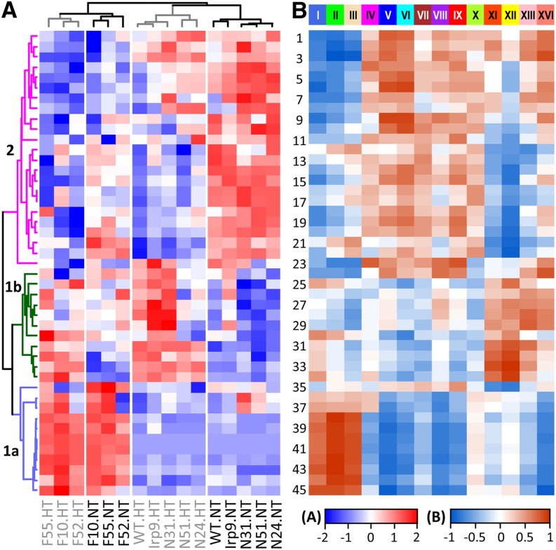
Figure 6.
Metabolite and Gene Network Correlation.
(A) Hierarchical clustering analysis of relative metabolite abundance across genotypes and treatments. Metabolite numbering and grouping are the same as in Figure 5.
(B) Heat map illustration of correlations between metabolites and module eigengenes obtained from gene network analysis. Modules are shown on top. Scale bars depict the correlation strength and directionality (positive or negative) for both panels.

