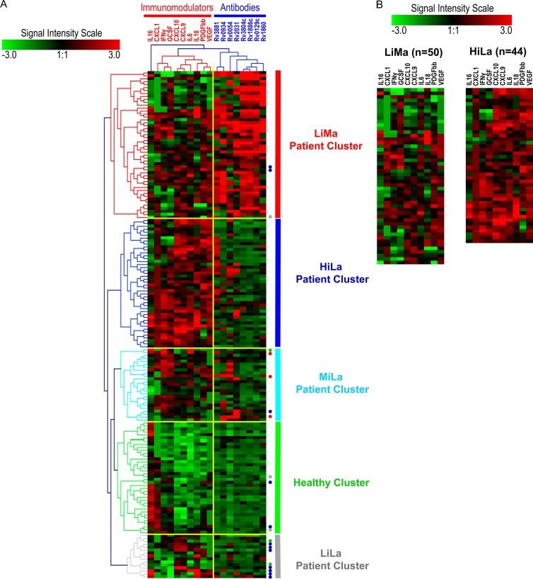
Fig 1.
(A) All samples were classified using computer algorithms based on two sets of variable biomarkers (antibodies and immunomodulators) into different computationally classified clusters. Analytes and their clusters are indicated by dendrograms at the top, and samples and their clusters are indicated by color-coded dendrograms on the left side of the heat map. Analyte and patient clusters are entitled as shown at the top and on the right side of the heat map, respectively. The extent of signal for each analyte, in each sample, is depicted by the intensity scale. The signal level in arbitrary units ranged from “−3 to 3,” with green as the minimum and red as the maximum signal intensities. Three sample clusters were most prominent: healthy individuals (healthy cluster) (green), the patient cluster with low levels of immunomodulators and multiple antibodies (≥3 antigens) (LiMa cluster) (red), and the patient cluster with high levels of immunomodulators and limited antibodies (<3 antigens) (HiLa cluster) (blue). Two minor patient clusters contained limited antibodies and medium levels (MiLa) (light blue) or low levels (LiLa) (gray) of immunomodulators. Misclassified samples are represented by colored dots on the right side. The color of the dot denotes the group that each misclassified sample belongs to. (B) Direct comparison of two major patient clusters (LiMa and HiLa) shows differences in the numbers and levels of immunomodulators in each sample. Notice that the orders of immunomodulators in panels A and B are different. This is because the results represent two independently performed cluster analyses.

