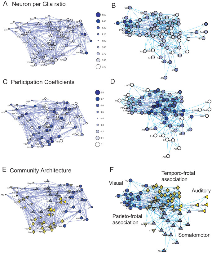
Figure 4. Comparisons between the participation coefficients and cell densities.
The spatial maps of the neuron-per-nonneuron ratio, participation coefficient, and module (or community) architecture are shown in Figures A, C, and E, respectively. Figure A is the same as the right figure of Figure 2-B. Figures B, D, and F are their reorganized network architectures using the Fruchterman–Reingold algorithm. The values, which correspond to the colors, are shown as bubbles at the right side of Figure A and C. The denser blue dots in Figures A–D indicate the relatively higher values of each main variable. Five different markers in Figures E and F indicate the five modules (or communities), which were defined using the Louvain algorithm. In Figures A, C, and E, the marker sizes were changed according to the depth of the brain regions.

