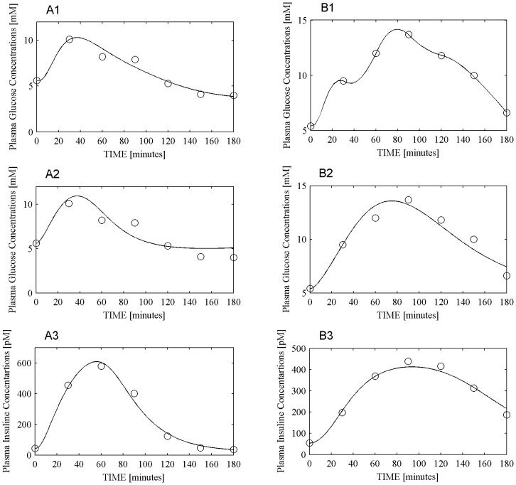
Figure 5. COMO, SIMO and DMMO model data fitting.
Panels A reports glucose and insulin dynamics for one IFG patient. Panel A1 reports observed (circles) plasma glucose concentrations together with their prediction using the COMO model (continuous line). Panels A2 and A3 report respectively glycemia (A2) and insulinemia (A3) concentrations (circles), together with the corresponding predictions obtained with the SIMO model (continuous line). Panels B report glucose and insulin dynamics for one T2DM patient. Panel B1 reports observed (circles) plasma glucose concentrations together with their prediction using the DMMO model (continuous line). Panels B2 and B3 report respectively glycemia (B2) and insulinemia (B3) concentrations (circles), together with the corresponding predictions obtained with the SIMO model (continuous line).

