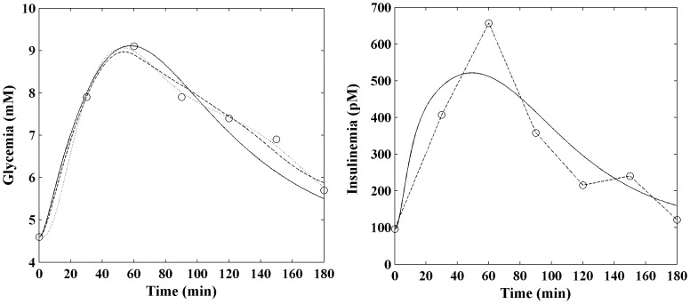
Figure 6. Comparison between fitting with predicted and interpolated insulin concentrations.
Observed glucose and insulin data (circles) for one NGT patient. The COMO fitted model (dotted line) is shown together with the SIMO model either when insulin is fitted (solid black line) or when insulin is interpolated (dashed line).

