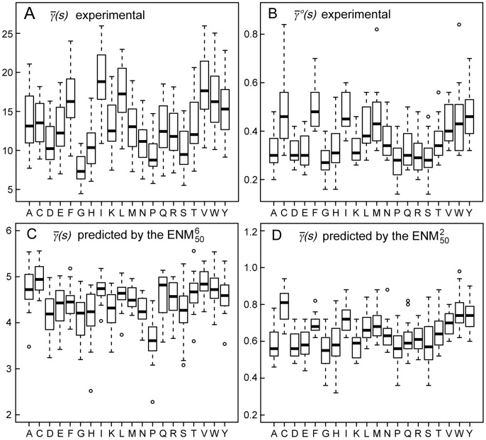
Figure 3. Comparison of the experimental and predicted values of the apparent stiffness  .
.
For each amino acid, the median value of  over the 20 possible partners is given in units of
  , along with the maximal, minimal,
  and
and  quartile values. Outliers from these distributions are depicted as circles. (A) Experimental values of
  , extracted from the dataset of 1500 NMR ensembles. (B) Experimental values of
  , extracted from the same dataset. (C) Values of
  predicted by the
  , on the same dataset. (D) Values of
  predicted by the
  , on the same dataset.

