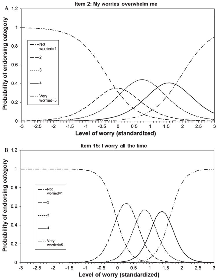
Fig. 1.

Item characteristic curves. Each line indicates the probability of a respondent with a particular level of worry endorsing a response category for the item. The x-axis corresponds to standardized (mean of 0, standard deviation of 1) worry scores and the y-axis corresponds to probability of endorsing the response category. Ideally, each category is the most likely category to be endorsed at a specific level of worry: a Item 2 follows the ideal pattern. b Item 15 has a particularly high slope and the curves are exceptionally peaked compared with other items (item 2)
