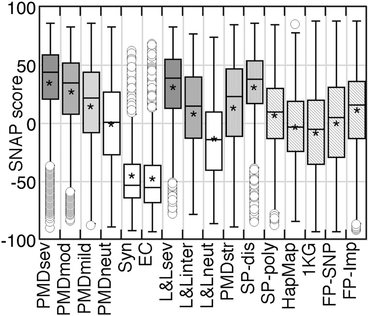
Fig. 2.
Summarizing the dataset distributions. The box-and-whisker plots and the distribution means capture the per-dataset trends. For each set, upper/lower box bounds represent the corresponding quartiles with the median shown as the crossbar. The “whiskers” of each box are the set’s minimum/maximum values with the outliers (points >1.5 times the interquartile distance away from the quartile bounds) not included in the calculations. A star in each box indicates the set mean. Solid gray and white boxes indicate functionally significant and neutral variants, respectively. Vertical shading indicates functionally unannotated variants, expected to be enriched for functional nonneutrals. Diagonal shading indicates that no inference of functional effect can be made for the set.

