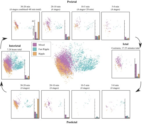
Fig. 3.
Outside: scatter plots of the HFOs in each time stage for patient C in the first 2 dimensions of the PCA space. Color indicates HFO cluster as in Fig. 2. Bar graphs show the average rate (events per minute) for each cluster. Center: scatter plot of all HFOs from patient C.

