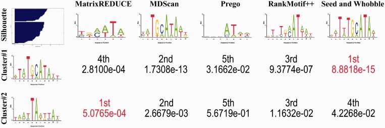
Figure 5.
Comparison of PWMs of Oct-1 as predicted by different methods. For the left-most column, the top entry is the silhouette plot for cluster analysis, whereas the other two entries indicate the two centroid path models of the HMMs trained by kmerHMM on the Oct-1 Array #1 data set. The first row shows the sequence logos for the PWMs learned by different methods on the Oct1 Array #1 data set [conducted by Chen et al. The figures are edited from (57)]. The remaining numeric entries are the expected values for the pair-wise motif matrix comparisons by STAMP (70). Those two centroids have been confirmed by the independent wet-lab experiments by Verrijzer et al. (71).

