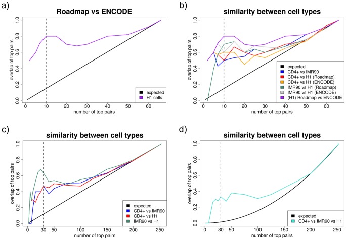
Figure 3. Similarity between experiments and cell types.
All plots have the same construction. The x-axis shows the number of top pairs that are considered  . The y-axis shows the proportion of these pairs that are found in the two lists being compared (three lists for subplot d), as an estimate of the similarity between partial correlation matrices. a) Similarity - within H1 cells - between Roadmap and ENCODE data, i.e. between experiments, using variables available in all datasets only. For the top 10 pairs, the overlap is 80% (
 ). b) Similarity between two cell types and between experiments, using variables available in all datasets only. For the top 10 pairs, the overlap is 50% between CD4+ and IMR90, and between CD4+ and H1 Roadmap (
 ), 60% between CD4+ and H1 ENCODE, and between IMR90 and H1 ENCODE (
 ), and 70% between IMR90 and H1 Roadmap (
 ). c) Similarity between two cell types for the 23 variables used throughout the study. For the top 30 pairs, the overlap is 47% between CD4+ and IMR90, and between CD4+ and H1 (
 ), and 63% between IMR90 and H1 (
 ). d) Similarity between all three cell types for the 23 variables used throughout the study. For the top 30 pairs, the overlap is 33% (
 ).
).

