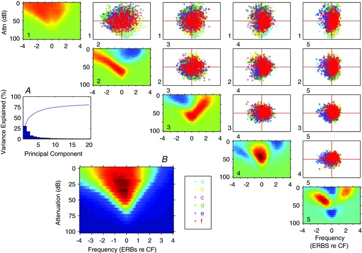
Figure 3. Principal component analysis of the frequency response areas.

A, bar plot of the variance explained by each of the first 20 principal components, the blue line shows the cumulative total. B, mean FRA obtained by normalising and summing all the FRAs. 1-5 (diagonally): the derived principal components. The scatter plots show each FRA in the sample, colour coded by its class assigned by clustering on the PCA weightings (see 6 clusters in Fig. 4), plotted according to the contribution of each pair of principal components to that FRA. For each plot the ordinate corresponds to the component to the left of each row, and the abscissa corresponds to the component shown at the base of the column. The plots below the diagonal would be mirror images so are not shown. The classes were obtained by k-means clustering of the 22 significant PCs.
