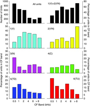
Figure 13. Distributions of the CFs of the six response classes derived from the 18 extracted parameter clustering.

The distribution of the CFs of the whole sample population is shown by the upper left bar plot. The remaining plots show the percentage of the units in each frequency band for each of the different frequency response classes. Classes are as shown in Figs 7 and 11.
