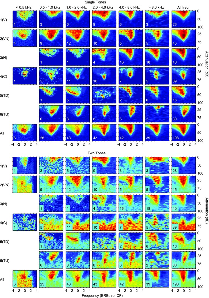
Figure 14. Comparison of single-tone response areas and those obtained with two tones: a single tone at 10 dB above threshold at CF and a roving tone at the level and frequency shown by the axes.

Top: averaged frequency response areas as a function of the CF. All response areas in the frequency range shown at the top were normalised and then averaged for the different classes. The normalised spike counts are shown on a temperature scale with dark blue as 0% and dark red as 100%. The numbers on each response area show the number of units averaged. Below: corresponding averaged two-tone response areas for the same units: see text for details.
