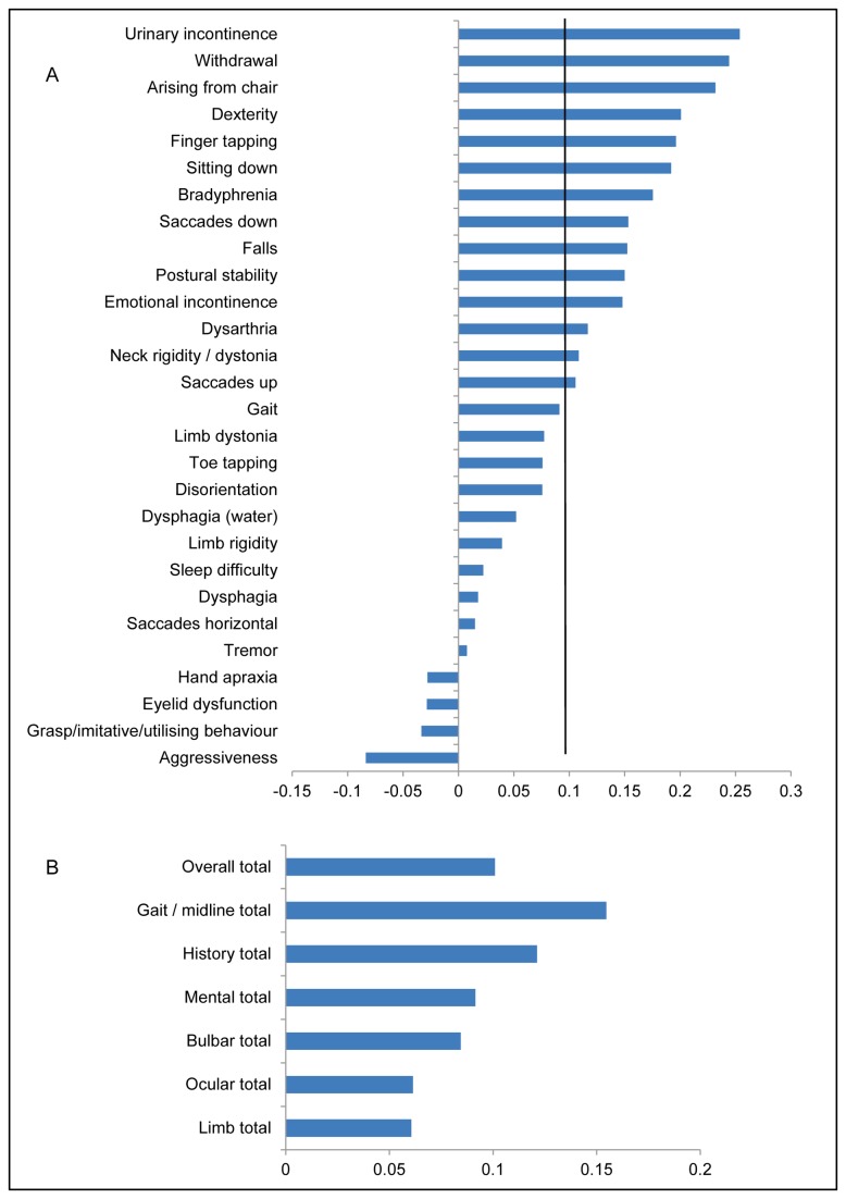
Figure 6. Graph showing the rate of change for individual items (A) and section totals (B) of the PSP rating scale (PSPRS).
Bars extending to the right of the y axis are those parts of the scale where there has been a worsening of symptoms, those to the left an improvement of symptoms. The scale on the x axis refers to annualised normalised rates of change. The black vertical line on Figure A corresponds to the mean change of the overall total of the PSPRS scale.

