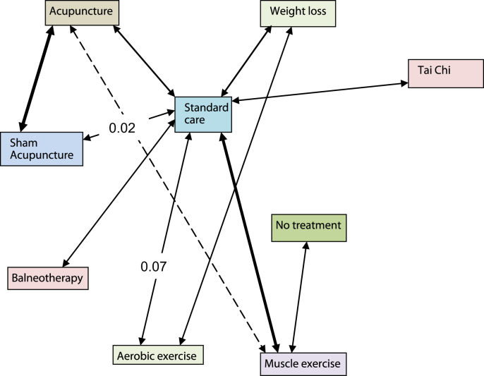
Fig. 2.
Network diagram for the end of treatment analysis of better-quality trials. The number of trials and patients included in the analysis are stated in Tables II(c–d). Each solid arrow indicates that there is a data point for that comparison entered into the analysis. The thickness reflects the number of trials. The dotted line reflects an extra comparison in a multi-arm trial. The numbers are a measure of inconsistency: 0 is no inconsistency; 1 is complete inconsistency.

