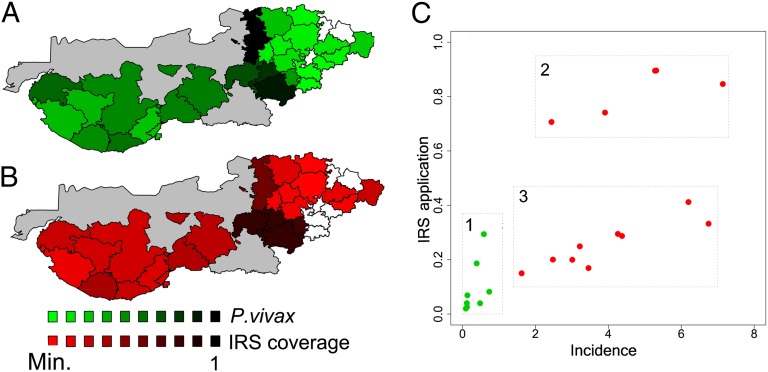
Fig. 3.
Spatial distribution of relative malaria risk and control application. (A)The spatial distribution of total incidence for Plasmodium vivax relative to its maximum value for the period of 2006 to 2010. The scale of green tones corresponds to values of malaria incidence relative to this maximum and spans values of “risk” from the lowest (0.006, in light green) to the highest (up to 1, in dark green). (B) Similar spatial distribution of the IRS effort based on the mean proportion of the population covered, again relative to the maximum value observed between the period of 2006 and 2010. Colors from light to dark red represent population covered with insecticide house spraying (IRS) according to the national policy, from a low (0.0004) to a high percentage, respectively. Talukas with no information are shown in white; gray areas represent the uninhabited Rann of Kutch. (Similar spatial patterns are seen for the period of 2000–2005 in SI Appendix, Figs. S6 and S7). (C) The three malaria epidemiological zones defined based on incidence, control, and irrigation. The mean proportion of population covered by IRS is shown as a function of median incidence from 2000 to 2010. Green dots correspond to the talukas that have been irrigated for a long time and present low malaria risk and low IRS coverage (zone 1). Differences in the level of IRS coverage for areas of high risk (red dots) can be observed between the talukas in Kutch with relative low control but high risk (zone 3) and those in Banas Kantha and Patan, the transition zone, that exhibit both high IRS application and high incidence (zone 2), with coverage reaching values of around 80%. Despite the downwards trend in cases, the existence of these three zones persist throughout the decade (SI Appendix, Fig. S10).

