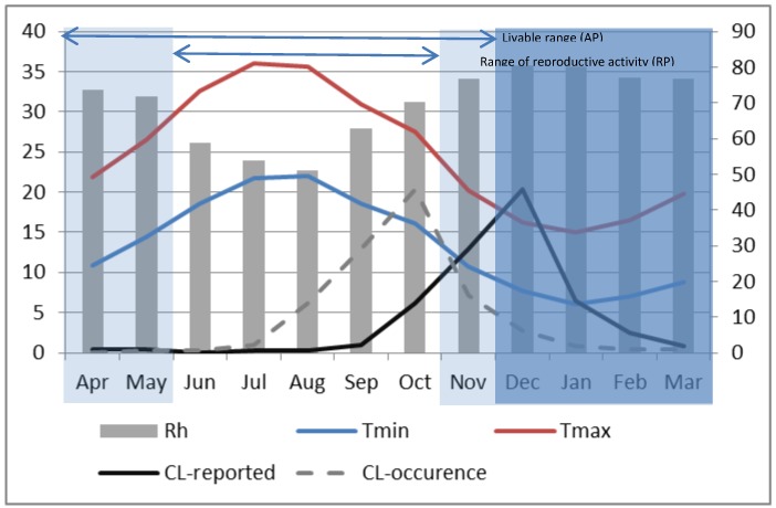
Figure 6.
Monthly composite relative humidity (bar, right axis). Maximum (red) and minimum (blue) temperatures (left axis) for P2 at Saida. Dark shading represents the vector’s period of hibernation. Active and Reproductive periods are indicated by horizontal bars at the top of the graph. The dark solid line represents the monthly average reported ZCL-cases during P2 and the dashed line shows the presumed ZCL-occurrence with a 2-month lag (right axis).

