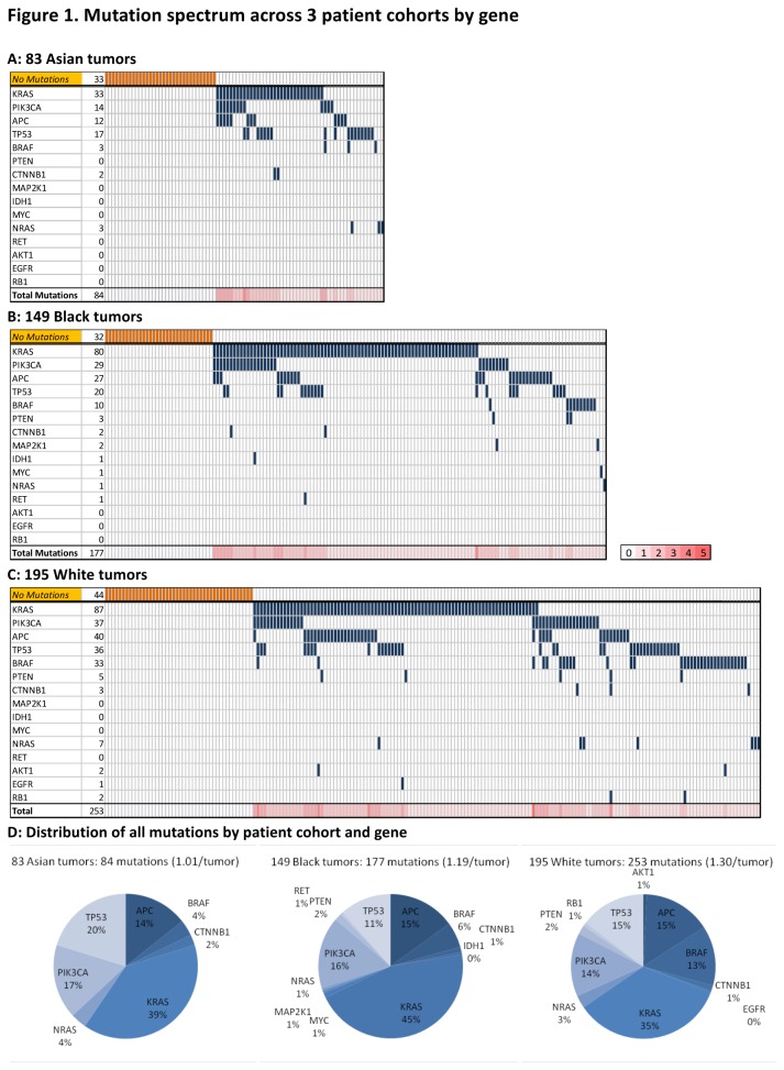
Figure 1. Mutation spectrum by tumor and gene.
A summary chart of all mutations in each group displays genes across in rows and patient tumors down in columns. The bottom row of each represents the total number of mutations per tumor as a heat map (0-5 mutations). Chart A displays Asian patients, chart B, Black patients and chart C, White patients. Chart D displays the distribution of all mutations for each cohort.

