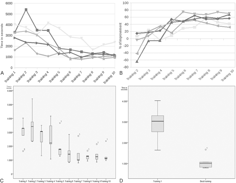
Fig. 3.

Descriptive and graphical analysis of data. (A) Graphical representation of training time for all four tasks for participants across trials. (B) Box and whisker plot showing percentage of improvement between first and fastest training for every surgeon. (C) Box and whisker plot illustrating operative time for each trial. (D) Box and Whisker plot comparing first trial against fastest trial. (p = 0.001).
