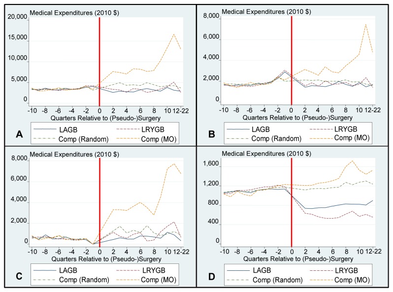
Figure 2. Diabetes Subsample – Mean Medical Expenditures By Quarter.
Panel A illustrates Mean Total Payments after matching in the Diabetes Sample. Panel B illustrates Mean Inpatients Payments after matching in the Diabetes Sample. Panel C illustrates Mean Outpatient Payments after matching in the Diabetes Sample. Panel D illustrates Mean Pharmaceutical Payments after matching in the Diabetes Sample. For scaling purposes, Q1 costs have not been included in the graph. The surgical date has been replaced with a red line. Comp is short for comparison sample; MO is short for morbid obesity.

