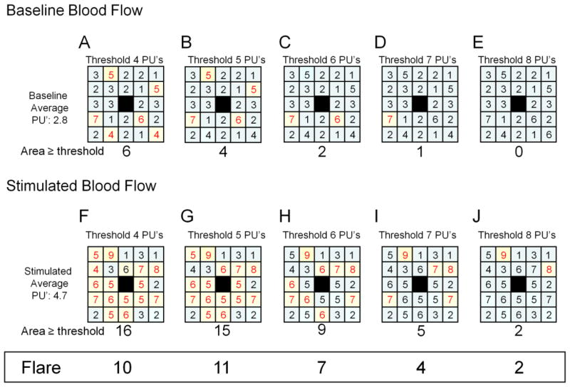
Figure 1. Flare area method.
This is an example of the flare area method. The top row of squares (A–E) shows the same baseline perfusion units (PU’s) for a sample series of scanned images (this example shows a 5×5 grid for simplicity, the actual image would be 36×37 pixels). The center box of each square (shown in black) is the region of iontophoresis and is not included in the analysis. The values in each square that are ≥ to the perfusion threshold (listed at the top of each square – the threshold is 4 PU’s in A etc.) are highlighted in yellow and shown in red text. Thus, in square A, six boxes have values ≥4 PU’s and are highlighted. The total number of highlighted boxes are counted and reported below each box (in A, the area exceeding the perfusion threshold is 6). The bottom row of squares (F–J) is the perfusion values post-iontophoresis. The data values are tested against a series of increasing thresholds ranging (in this example) from 4 to 8 (A–E and F–J). The difference in flare area between the baseline (A–E) and stimulated (F–J) region is listed at the bottom of the figure in the box entitled “Flare”. In this example, the largest Flare response is with the threshold set to 5 PU’s where baseline flare area of 4 (B) and the stimulated flare area of 15 (G). The difference between baseline and stimulated areas is a flare area of 11.

