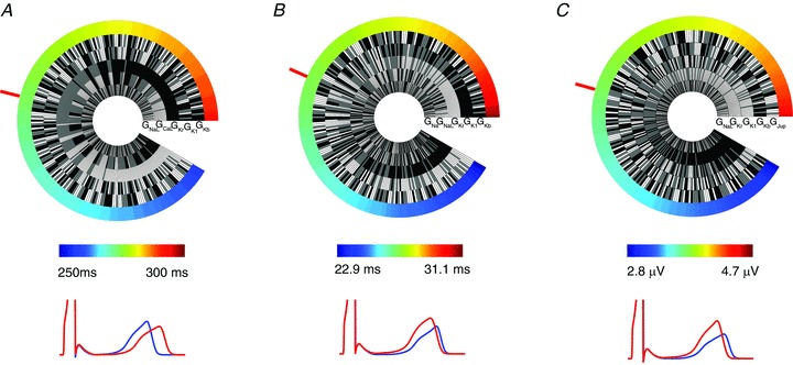
Figure 5. Genetic wheel of fortune plots.

Data are shown for QT interval (A), Tpeak– Tend (B) and Theight (C). In each case the mean value is identified with a red bar. Pseudo ECGs simulated using the ionic conductance combinations from the extreme minimum (blue) and maximum (red) of the wheel are shown in each case. Grey, black and white segments represent conductance levels of baseline, 10% decreased and 10% increased, respectively.
