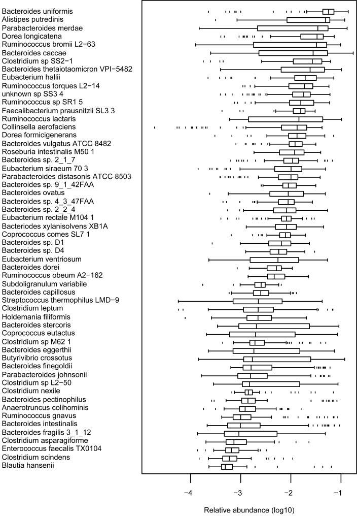
Figure 3. Relative abundance of frequent microbial genomes among individuals of the cohort.
Boxes denote 25% and 75% percentiles, the black line in the box corresponds to the median, the “whiskers” indicate the interquartile range from either or both ends of the box, the dots show the outliers, beyond the ends of the whiskers (See supplementary Methods for computation).

