Figure 3.
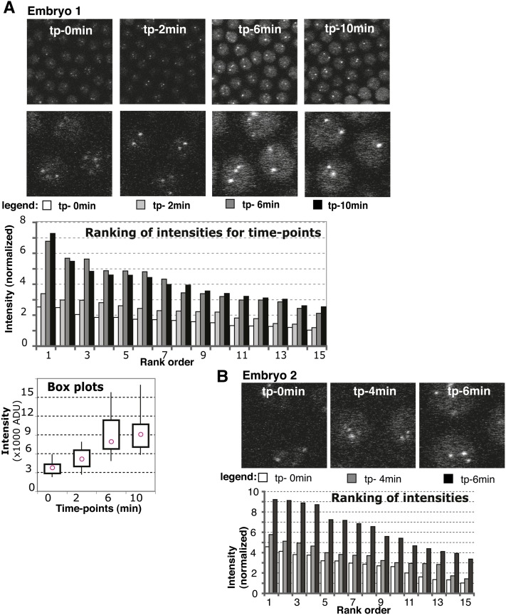
Time-lapse series analysis of EGFP signal. (A) Embryo 1 intensity distributions. (Top) Panels used for measurements are shown for each time point with zoom-in below. Time points (tp) are indicated within the top panel. (Bottom) Ranking graph: data for each time point were ranked and represented with different shades of gray as indicated in the legend underneath the images for each time point. y-axis: intensity is normalized to the smallest intensity value from the whole series (set to 1). Box plots graph: intensity distribution for each time point with pink circles showing the median value. x-axis: time point. y-axis: intensity, actual values [in thousands of arbitrary densitometric units (ADU)]. The boxes contain data between the first and third quartiles, while whiskers extend to minimum and maximum. (B) Zoomed-in images and ranking graph for embryo 2, presented as in A.

