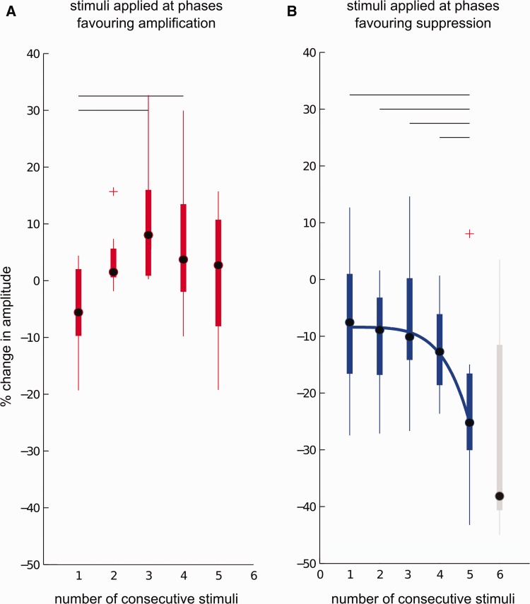
Figure 7.
Effect of stimulation history on tremor amplitude during fT Hz stimulation. Tremor amplitude modulation shows a strong dependency on phase history and consistency of preceding pulses. Although tremor amplification plateaus and cannot be exacerbated, tremor suppression increases non-linearly with stimulation over consecutive cycles at tremor phases favouring suppression, indicating a cumulative suppressive effect of stimulation that can be exploited to increase tremor suppression during low frequency stimulation. (A) Group mean percentage change in tremor amplitude showed dependency on the number of consecutive stimuli delivered at tremor phase values favouring amplification (eight subjects, repeated measures ANOVA, P = 0.005). (B) Group mean percentage change in tremor amplitude showed dependency on the number of consecutive stimuli delivered at tremor phase values favouring suppression (nine subjects, repeated measures ANOVA, P = 0.02). Blocks of consecutive stimuli showing differences following multiple comparisons are highlighted with a horizontal line (10 multiple comparisons, P ≤ 0.05, FDR corrected). For suppression, the effect of consecutive stimuli on tremor amplitude was non-linear and was fitted with a power function, shown as a solid blue line (R2 = 0.9919). If five thalamic pulses are consecutively delivered at tremor phases favouring suppression, tremor suppression increases threefold reaching a median suppression level of 26%. Effect of six consecutive stimuli is shown in grey. Median tremor suppression reaches 38%, indicating that the non-linear cumulative effect persists. As six consecutive stimuli were only observed in 50% of the subjects, this was not included in the repeated measures ANOVA or the fit. In A−B, the central dot is the median; edges of the boxes are the 25th and 75th percentiles while the whiskers extend to the most extreme data points not considered to be outliers. Outliers (denoted by a red cross) are plotted individually. A data point is classified as an outlier if it is outside q25 – 1.5*(q75 – q25) and q75 + 1.5*(q75 – q25) where q75 and q25 are the 75th and 25th percentile values.

